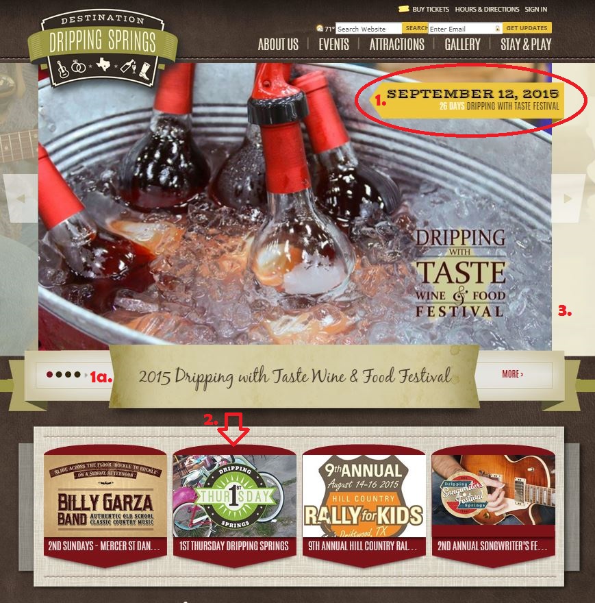
We want to share some best practices for creating a homepage that is enticing, informative and inspires your customers to click a little further into your website and decide to purchase. Destination Dripping Springs is currently promoting their big September event Dripping with Taste, and we think their use of titles, photography and secondary features on their homepage intrigues you without completely throwing ALL the information in your face at once.
1. The Homepage Countdown is the best tool to clearly post the upcoming event dates and name on your homepage. Similarly, using the (1a.) Main Homepage Feature Title is another great resource for prominently displaying your event names, but don’t rely on the feature titles to do all of the work for you. Keep them clear and short so the interested customer can confidently click deeper into your website.
2. Use your secondary feature to promote your smaller community events. Have a recurring monthly farmers market or mini art festival? Keep these events posted in the same place on your homepage all season long, in your secondary feature, so website visitors understand it is a consistently up-to-date reminder of upcoming events they should routinely check out. Again, be brief with your content. You want the title and image to be enticing enough to get visitors to click (this will always help reduce your bounce rate)!
3. PHOTOGRAPHY is really where you’re going to draw customers into your site. Be aware of the amount of text you add to your main feature images, as you don’t want it to be difficult to read. Keep it simple, but be inviting! We recommend using stock photography if necessary, especially if a more generic crowd shot can better convey your message over some of your own photography.
If you’re struggling with using your homepage features and need a refresher, check out Week 5 of Saffire U in Spark. If you need a little bit of team brainstorming, reach out to us at coach@saffire.com so we can help make your homepage work for you and tell that story!
